Spantech is one of the fastest growing manufacturers of modular structures in Europe. Developping modular solutions for various industries. Contributing to circular construction practices and building for a greener future.
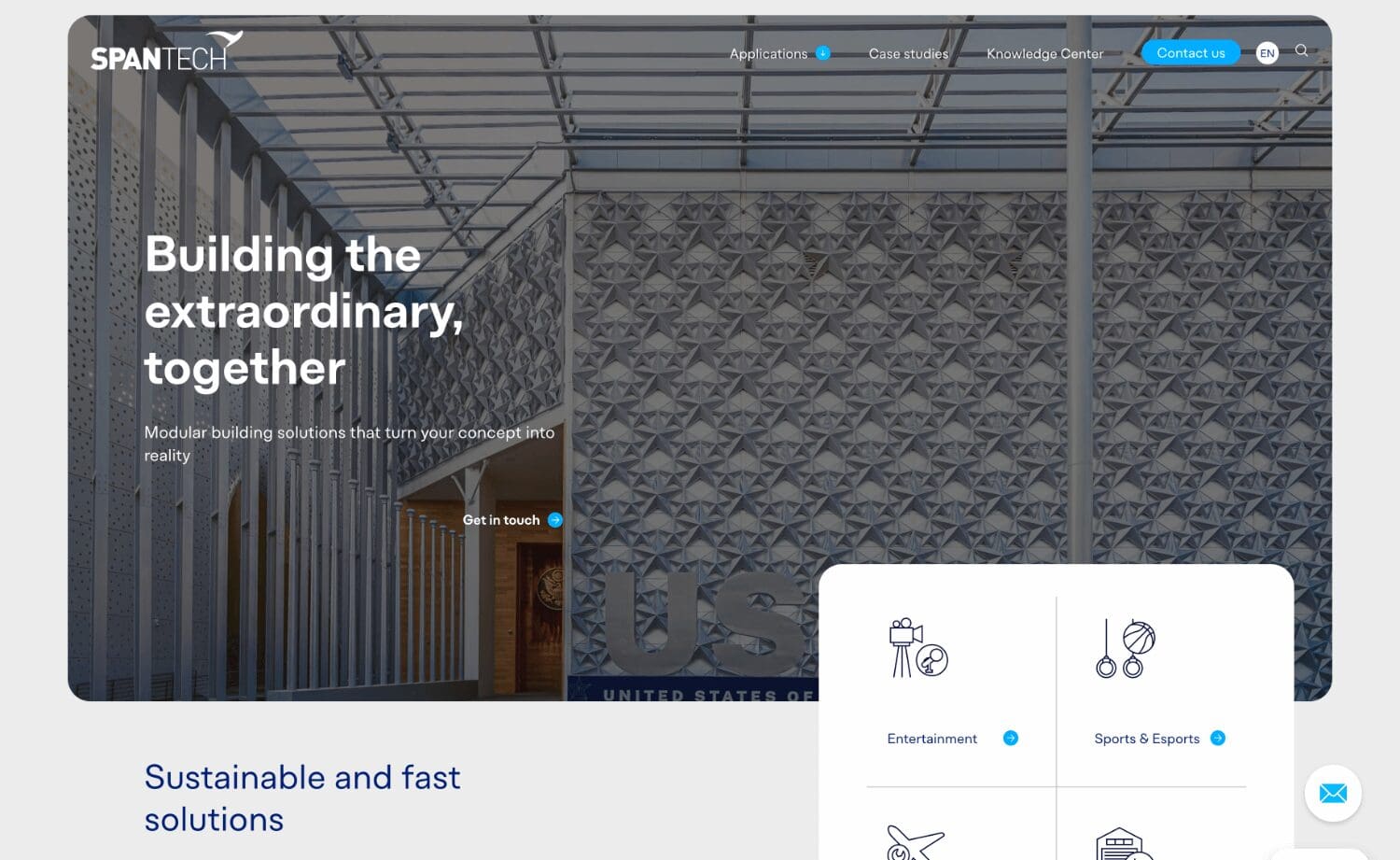
Building the extraordinary, together.
At Spantech they design, build and install purpose-built structures all over the world. With over 20 years of service to the industry, we have earned a reputation as expert design and build specialists.
They were looking for a new website, including webdesign, development and content migration from the old WordPress to the new one. The migration needed to happen for a website in 4 languages – with a lot of attention to their international growth.
Our approach.
Experience with the american and more international markets with their way of storytelling was an important factor!
UX/UI Design
The branding could not be touched. The logo remained as is, together with the base colors. We’ve partnered up with our colleagues from KOLOS for the branded webdesign of this project.
Moodboards were made to get a better understanding of the client’s preferences and different design versions rolled out afterwards before development started.
Development
We’ve chosen for WordPress as CMS for this project as the old website already existed in WordPress. Therefore the WordPress CMS is already familiar for the client and the people who will maintain the website.
The website is as modular as Spantech themselves, as each page on the website has access to all the different building blocks and components. Landingpages, blog posts, articles, services, … can all be adjusted, removed or added by the client thanks to a visual interface.
No page builders like Elementor or Divi are using in this project to maintain performance and simplicity on the dashboard.
Migration
The existing Spantech website was already made in WordPress. This eases up the migration process, but still required a lot of attention because the website exists in 4 different languages.
All the URLs need to receive their correct redirect, hreflang and canonical tags. Each translation needs to keep their ‘translated post’ relationship to ensure the website structure.
Maintenance & Support
After launching their brand new website, we also consulted and migrated 2 other of their websites on their new hosting. This significantly decreased their hosting costs for all their different websites as they are now bundled on the same package.
Navigation Hub
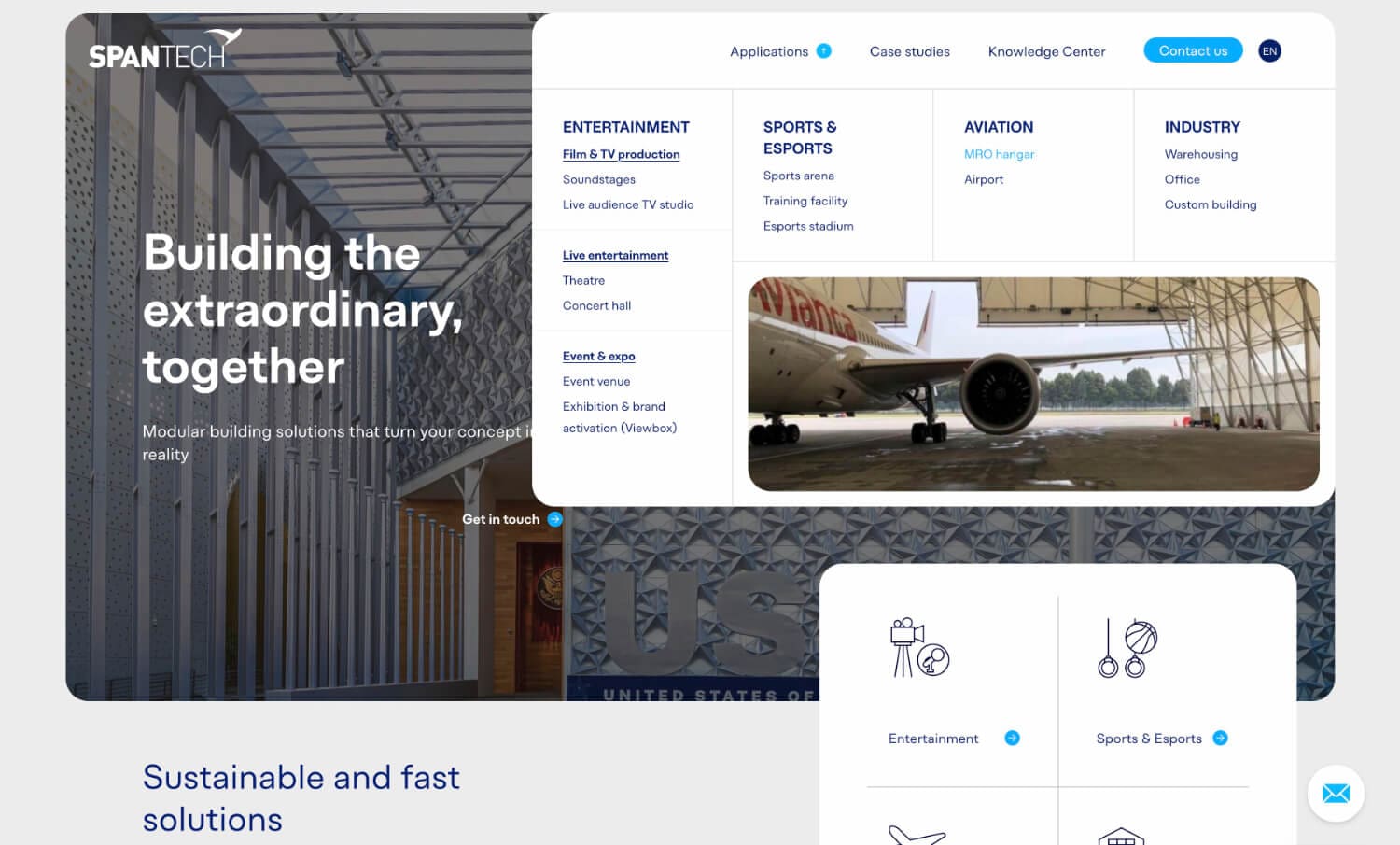
The megamenu for the applications was a nice challenge. The hub has it’s boundaries bound to the hero image. Hovering all different elements in the menu will show/hide a quick preview.
We chose for this display to quickly let people know what they can expect from the application they will be selecting, before actually clicking on the application.
As not all visitors are familiar with all the products and their names. They can now hover the menu to see a quick overview of everything.
